Websites I Made for Writers

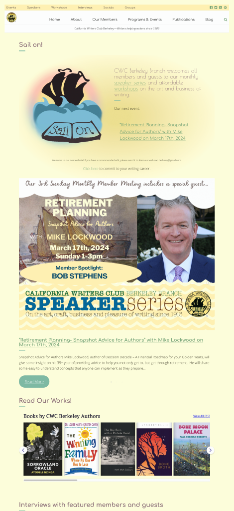
The Berkeley California Writers Club
This is a big website with a lot information. In their new site, I simplified the navigation to make things easier to find. I used custom codes to automatically show upcoming events on related pages. For example, if there is a blog post about workshops, it will automatically show up on the descriptive page about the club’s workshops, but not on the Speaker Series page.
Because I also create most of the posts for this site, I’ve been able to ensure a consistency of brand with unified colors and fonts.
Historical Fiction Author Website
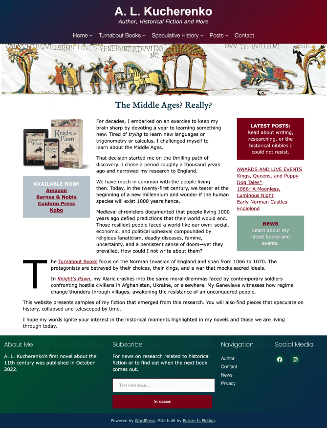
AL Kucherenko

AL Kucherenko explores political topics through the lens of history. Her first novel centers on the Norman invasion of England in 1066. It will be published in 2022.
I built her new site with a theme that uses WordPress’s new full-site editing options. Since the author was new to WordPress, I wanted to her to be able to learn the tool as it will be used in the future, and the full-site editing experience meant that when she learned to edit Posts and Pages she would also be learning to customize the style of her site.
The images used for her series on William the Conqueror were based on a famous medieval tapestry depicting the invasion. I cut them into layers to create centerpiece images that modernize this with some animation, so that the armies appear to move as the user moves about the page. The colors chosen were rich royal hues to match the royal Medieval aesthetic. Since not all of Kucherenko’s work is historic, I took care to balance the Medieval look with modern elements that will work well on her pages about science fiction. I added her new color scheme to the backend’s default color and gradient palates, so that when she adds new content it is easy for her to stay consistent in her brands colors. I used the gradients heavily throughout the site, both to add to the modernity, and to combine these bold colors in a way that is pleasing to the eye.

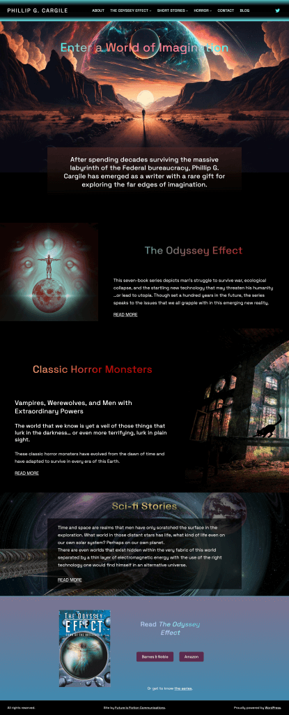
Science Fiction Author Phillip Cargile
Cargile writes science fiction and horror stories. Since these genres are focused on world-building, I created a splashy, colorful site that stirs the imagination. The Horror page is particularly fun, as it has black bats that chase your mouse as you scroll. Since his goal is to promote his series launch, I have a link to buy it in the footer. This ensures the call to action is not only on the pages I created, but on every new page he creates in the future as well.

A Thoughtful Debut Author
Rachel Callaghan
I built Rachel’s site to promote her debut novel, Under Water. They didn’t want anything too flashy, but since it is literary fiction I did want to add a few elements that make the site look sophisticated. So we went with a simple homepage while I created a striking animation on the book’s promo page. The effect is to suggest an infant under water, hinting at some of the conflicts in the story as well as the event that catapults the story into action. Every page of the site has an eye-catching wave that sets up the call to buy the book or read the excerpt.

Helping the Next Generation of Scholars Reach their Goals
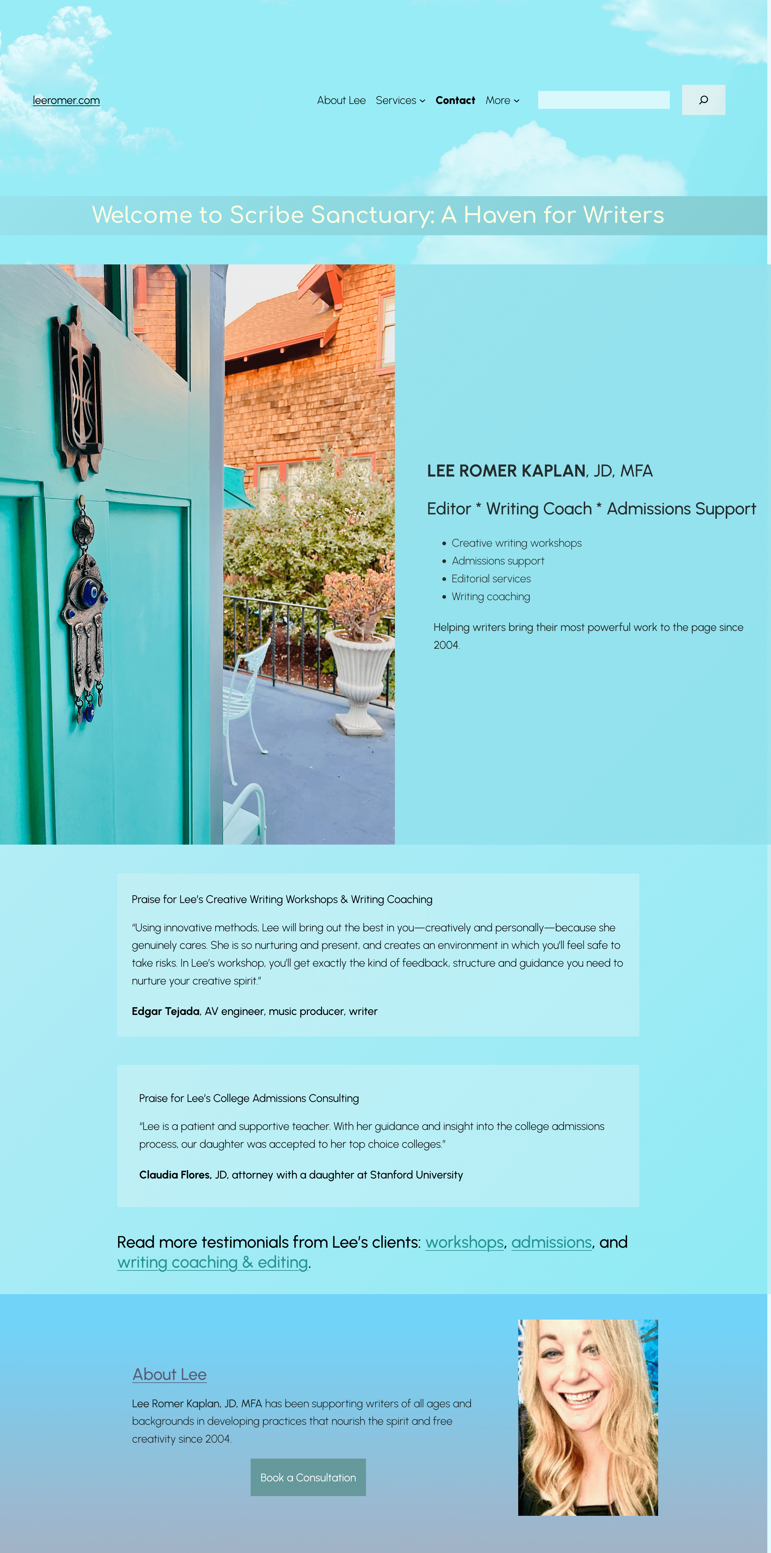
Lee Romer
Lee is a writer and scholar who offers a variety of freelance services related to academia. She wanted a simple site with soothing colors. It was also important to Lee that the site remain professional while also offering a relatable, human touch. Many of the photos throughout were sourced from her home and travels, rather than stock photos. I enjoyed the challenge of creating a beautiful site that both reflects her cozy brand and makes use of amateur photography.
Mystery Writer Website
Heather Haven
Heather Haven is a witty and fun mystery writer who loves her cats, so I used these feisty critters throughout the design. I stuck with a red and black color scheme that would complement without competing with her brightly colored books.
Her site is backed with a puzzle/maze background, suggesting the element of mystery. For her main series, I took elements from her cover designs and created images that break out of the frame in various ways. She has several holiday mysteries, and for each one I created a page design that plays with relevant historical holiday photos integrating the red and black maze pattern in different ways. Haven also has a book about her mother’s life in the circus. For this page, I deviated from the color scheme to punch up real photos of her mother from her circus days.
Haven has won quite a few contests and awards, and in making the site I helped her track down the original links and badges for these prizes.

Website for Outspoken Racial Justice and Feminist Memoirist
Laurie Panther
Laurie Panther is an educator who has written a memoir about overcoming trauma and grief. The only survivor in a large family, much of her biography centers on growing up in a racially diverse home in Berkeley in the 60s and 70s. So for her website, I used funky, bold, retro fonts and the muted colors of beatnik fashions.
Spiritual Scholar and Activist Website
Emily Leah Silverman
Emily Silverman is a feminist and spiritual scholar. She has written two books, Voices of Feminist Liberation and Edith Stein and Regina Jones. She is planning an interview series of scholarly activists.
Using a video she took of the sunset in San Francisco, I created a one page site with varying layers of transparency.
Website for Artist and Author’s New Novel…about Bears!
Al Sandine
Al Sandine has written three sociology books, but for his new project he has leapt into uncharted territory with a novel in a fantasy world with sentient bears. The website lures you into the book by first introducing you to the characters and then inviting you to experience an excerpt. Since brown bears would come into the imagery in some way, it made sense to use a color scheme that made use of brown, and I complemented this with a cool blue, so the site wouldn’t look too muddy.
An Author Spreading the Word about Wildfire Prevention
Robert Sieben
Dr. Robert Sieben had already written several successful medical self-help books before he set out to help homeowners prevent and prepare for wildfires. Living in Hiller Highlands, the epicenter of the catastrophic 1991 firestorm, Sieben has become devoted to spreading the word on this topic. His site colors are fire engine red and a blue picked from the sky on the cover of his book.
Because Sieben doesn’t have the time to blog frequently, I created an automated newsfeed page for his site, that gathers the latest news stories on wildfires. This is terrific for his SEO.
A Blog for Fiery Political Novelist
Henry Hitz
Henry Hitz has recently retired from running an Oakland nonprofit for teachers. He writes shameless and daring political thrillers. His first book centers on the Jamestown massacre and the murder of Harvey Milk…his second book is too scandalous to publish in his own name!
Henry wanted a traditional blog-style layout. Because he is well-connected on Facebook, I removed the standard WordPress comments and substituted Facebook comments instead. One can easily comment on his blog, and have the comment show up on Facebook as well, just by checking a box.
Websites for Other Professionals

Cascade Cooperatives
A cooperative uniting cooperative businesses in Washington.
They wanted to be free of their cumbersome and slow pagebuilder. They were also posting blogs manually to a static page; this was remedied so that posts are automatically archived as new ones are posted. I removed their pagebuilder and created a slick design that uses WordPress’s native features so it is much faster and easier to use. The colors for the site were based on their existing logo. I updated the backend so that their default color options include their logo colors, as well as customized gradients (one is in use in their footer). On their new About Cascade Coops page I created an interactive timeline feature. I created a custom block for the mountain header at the top of the page, so their team can easily add that feature to any page.
Their new site was built with a theme that takes advantage of WordPress’s new full-site editing options, so it will be easier to customize in the future. It was built in a staging area so their old website remained up and functional until launch day.
Xenofonix Music
For additional work samples, see my design portfolio on Behance.